Lululemon Boys Apparel (Case Study)
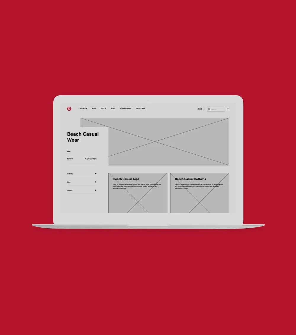
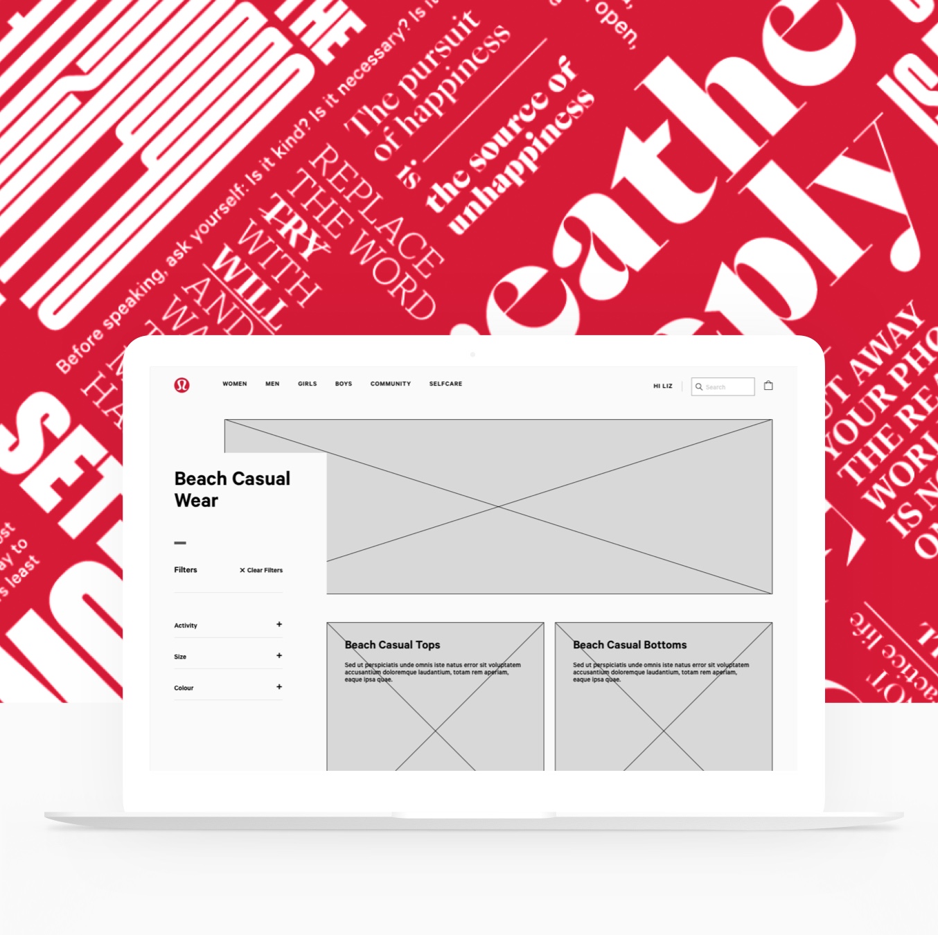
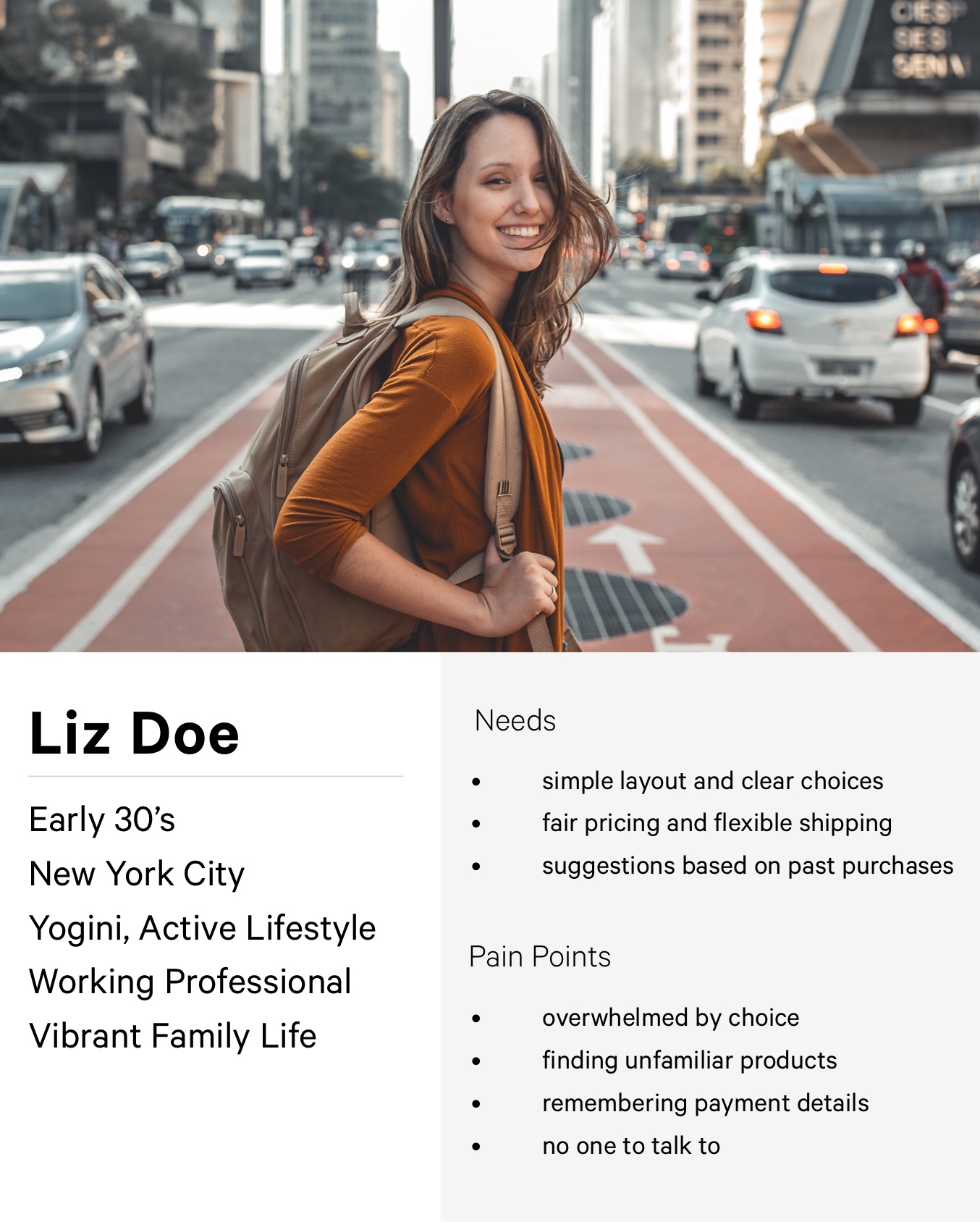
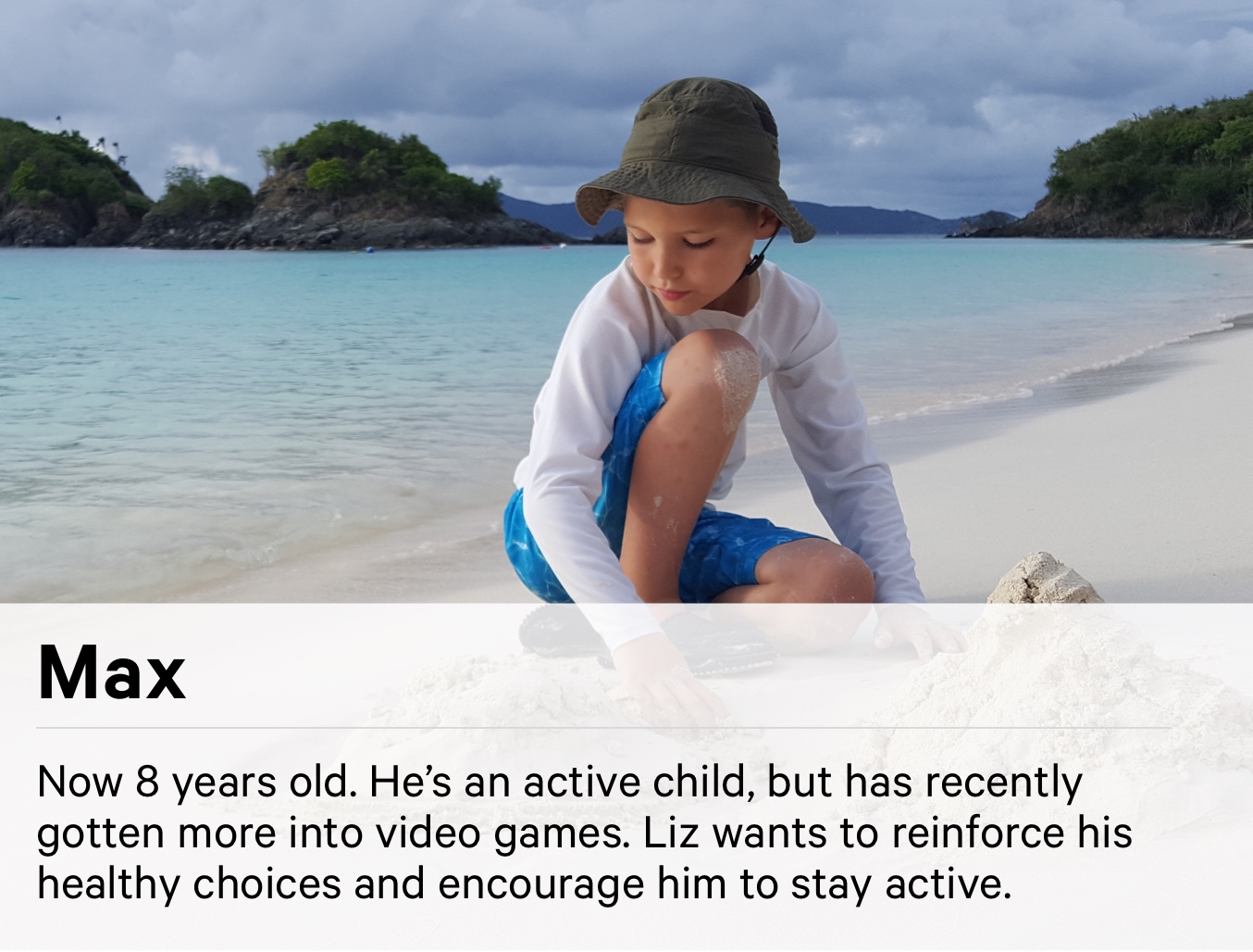
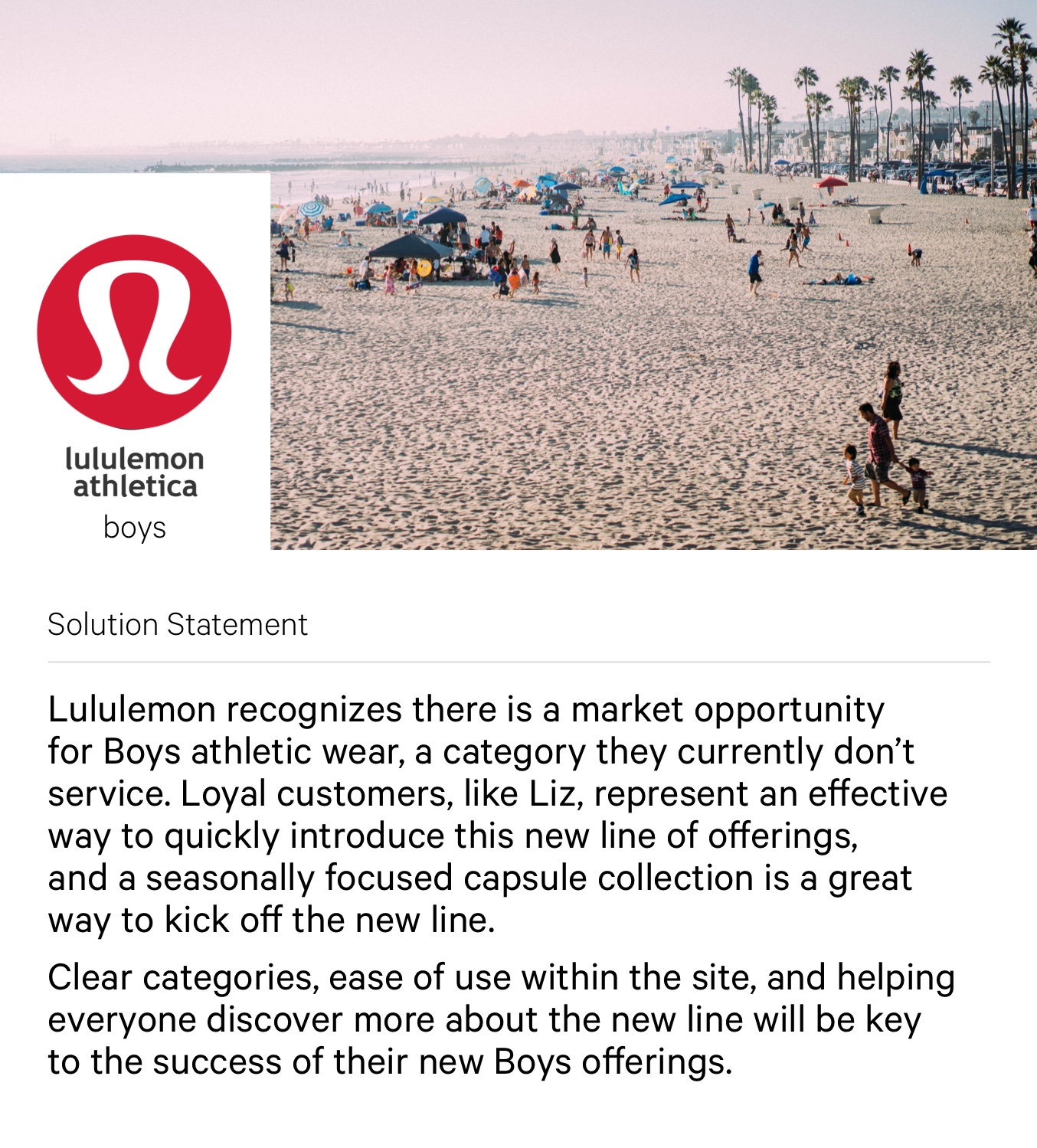
Lululemon does not currently offer a boys line, which doesn’t quite align with their intent to “build a community where we can live our best life.” What a perfect opportunity to add to their existing lines! With that in mind, I created a boys clothing seasonal collection landing page showcasing their new line of boys apparel, with those “end of summer” family trips to the beach as the theme.
Where to begin?
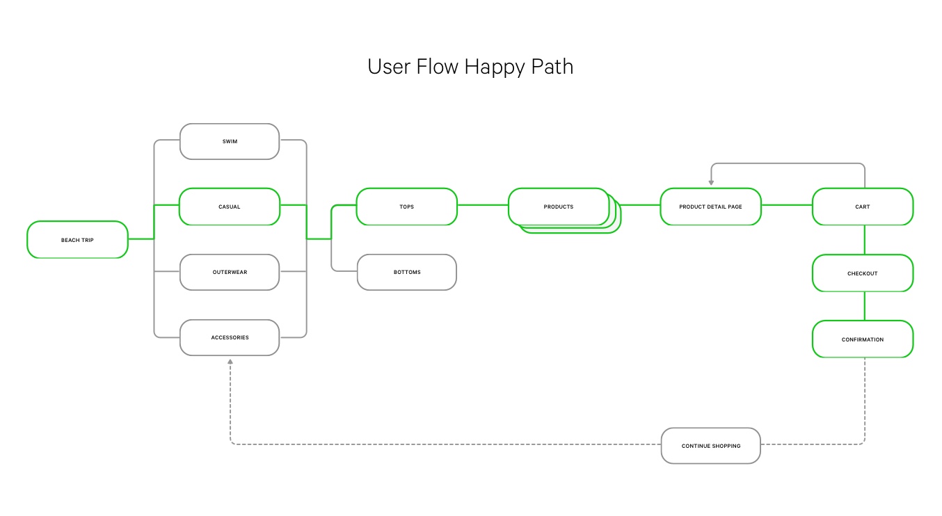
I tackled how a dedicated Lululemon customer would navigate through the purchase path within this new category, and streamlined the current Lululemon online experience and cart flow in the process.
How may we help you?
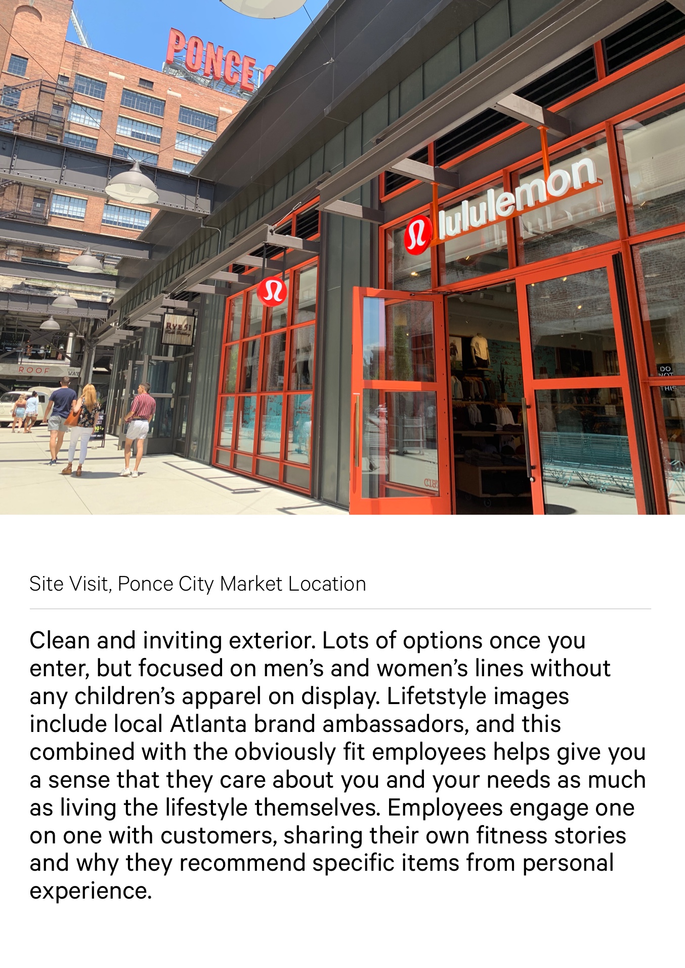
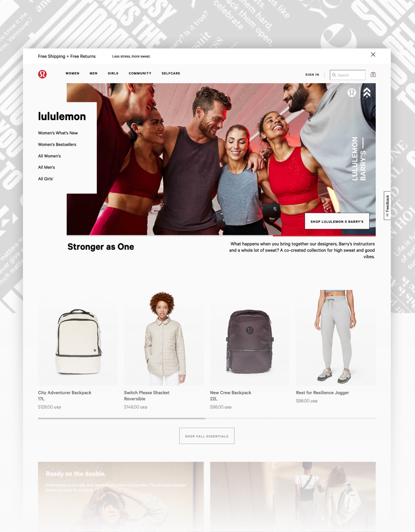
With an already thorough information architecture and design language, the challenge was to effectively and seamlessly integrate this new line into the existing site. What little tweaks could be made to streamline the experience, and what was the competition doing better than Lululemon that we could learn from? A heuristic evaluation and competitive analysis helped focus on and refine key areas of the Lululemon purchase path to focus on, especially in their checkout experience.
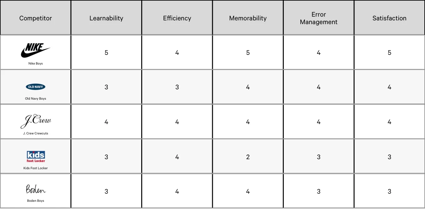
Heuristic Evaluation
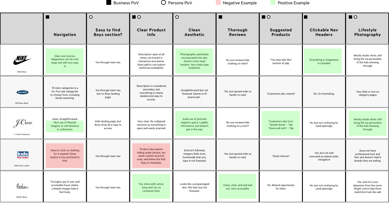
Competitive Analysis
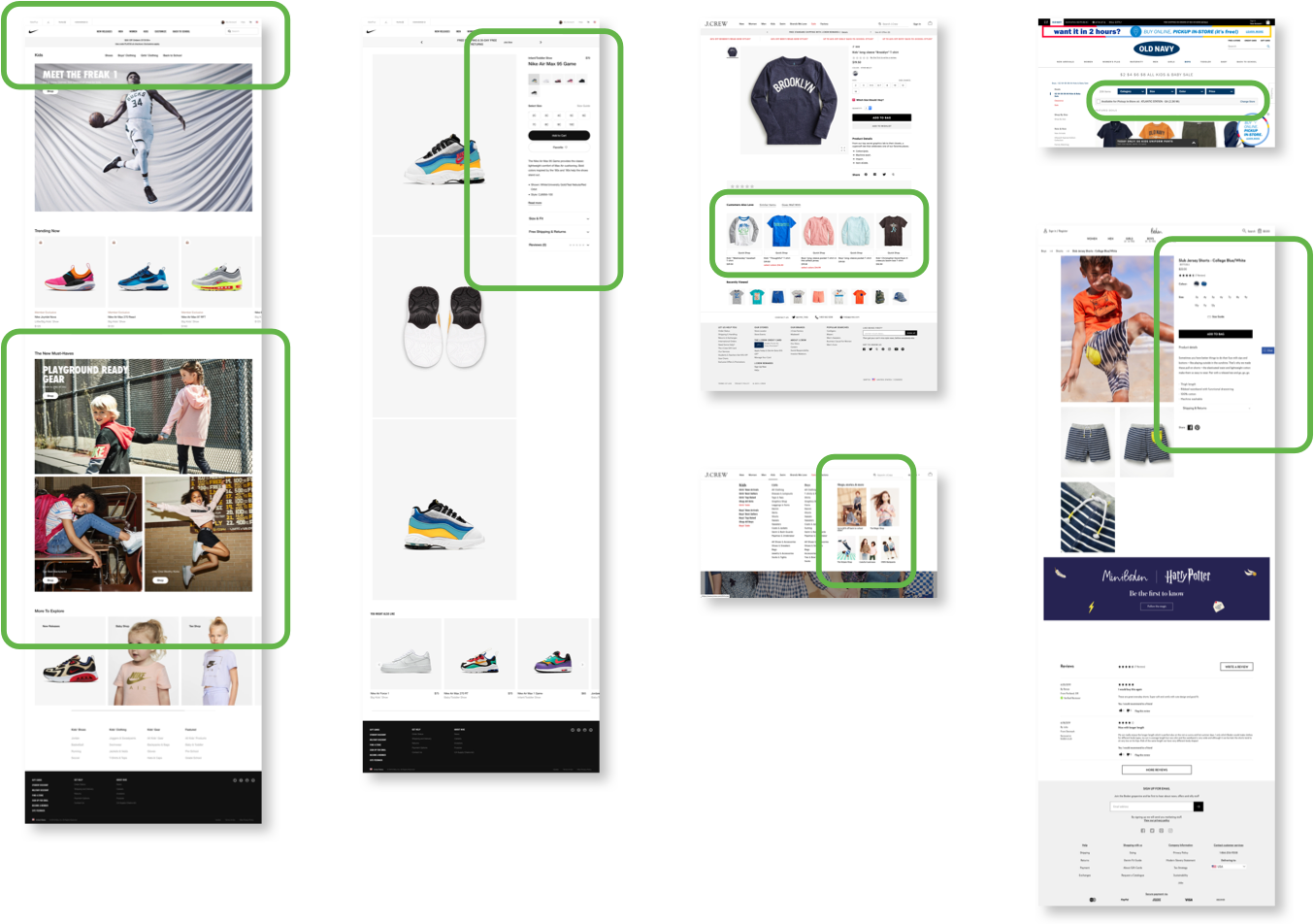
Competitive Analysis Insights
Pick a Card, Any Card
Focusing on open and closed card sorting as a research method, I had 12 test subjects sort 40 objects related to the new line and our “end of summer trip” theme. There were a few oddball items in the mix, allowing for users to help further refine and define categories that would make the most sense. Starting with open card sorting, it was clear users spent a significant amount of time attempting to separate accessories into their own sub-categories. Once we moved into closed card sorting, that pain point was all but negated. The user’s need to see material samples also came to the forefront, as distinguishing between regular shorts and swim trunks was extremely difficult with the thumbnails supplied for the tests.
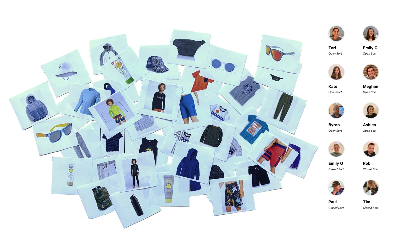
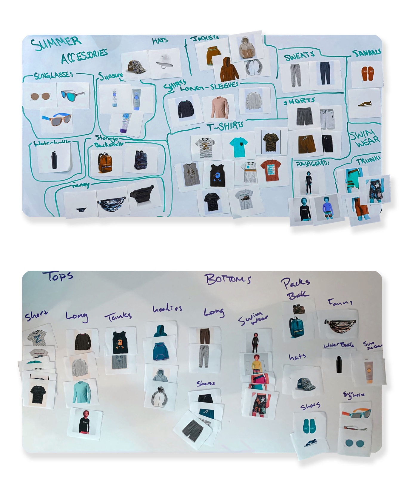
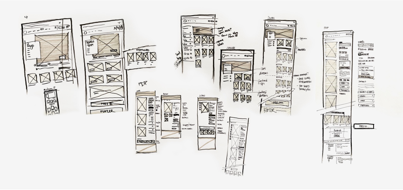
Putting insights (and pen) to paper
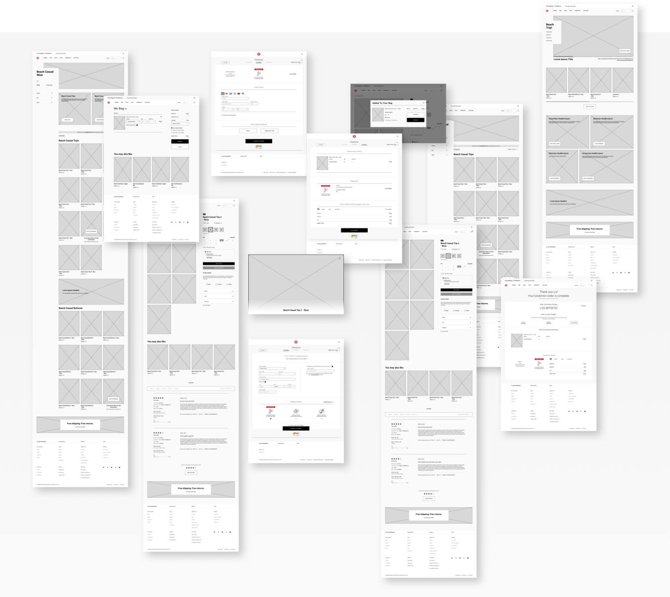
How will a user travel through the experience? Have we removed as many paint points as possible during this design sprint? Let’s create a clickable prototype to test it out! I built out the pages in Sketch, implemented their current design system with lots of tweaks along the way, and then exported a clickable prototype with Invision’s Craft plugin. Further refinements were made from insights gathered during two rounds of user testing.
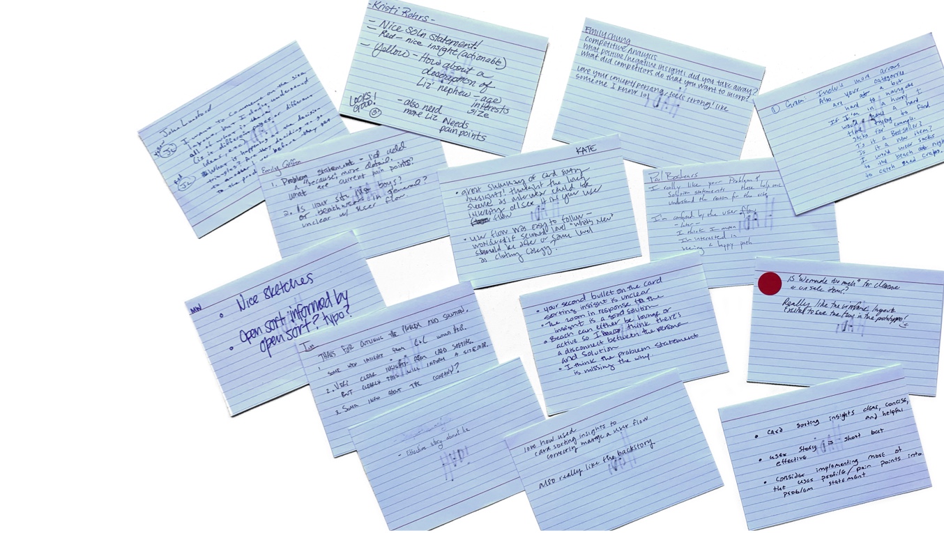
Mid-Sprint Feedback
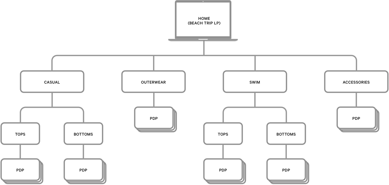
Site Map
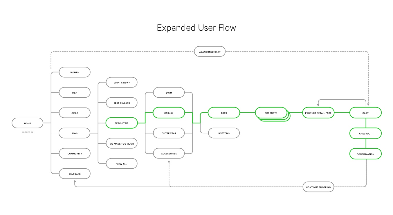

User Testing
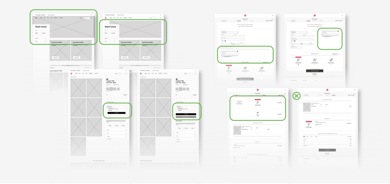
User Testing Feedback integration
Sprinting to the finish line
At the end of the design sprint, I created a short 8-minute presentation to walk major stakeholders through the progress made, focusing on how unearthed insights could benefit their current user flow and therefore their bottom line.
Lulu Boys Line Walkthrough
GA UXDI 18 - P2

Next Steps
Here are some next steps I would love to explore in a future sprint:

Integrate color and iconography to help differentiate items
Design and test dropdown megamenu
Refine user testing script
Test full site from dot com homepage
High fidelity mock-ups and animated clickable prototype
